PUCP Móvil - Case Study
«PUCP Móvil» is a mobile application developed for university students of PUCP managed by the Information Technologies Directorate of PUCP, through wich students can carry out varios process: View courses, schedules, dining halls, cubicles, grades and payments.
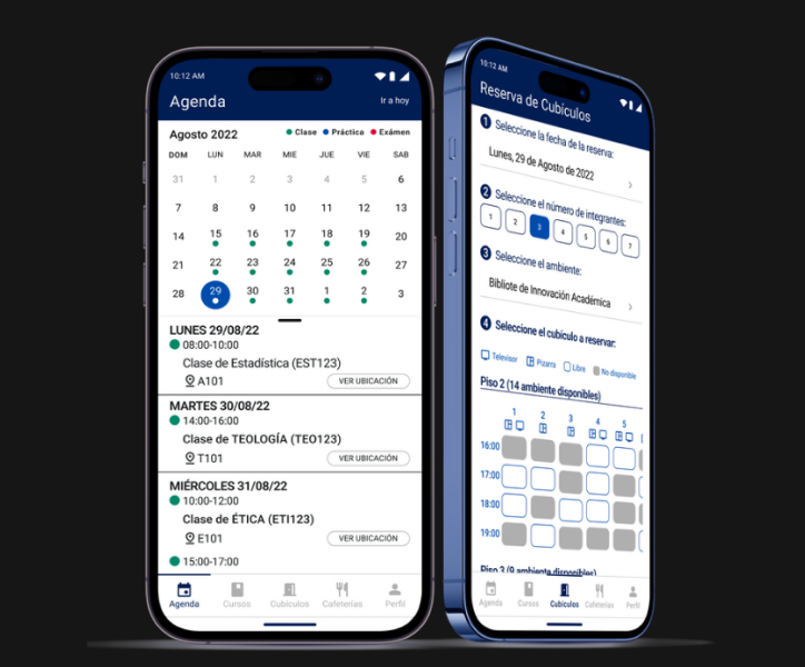
EMPATHIZE
Usability is a fundamental aspect for software creation, as Ahmad and Hussaini (2021) state «The real effects of using mobile applications in higher education will depend on students’ viewpoints and whether they are usable.»
Regarding the background, it is observed in the Google Play and App Store app stores that the application has a very low rating, accompanied by comments that indicate the following:
- Lacks other functionalities.
- Confusing information.
- Failures within some processes.
- Very outdated interface design.
- Errors on some screens.
Usabiliy Testing
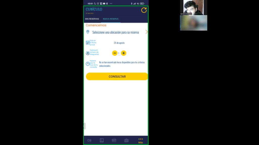
Results
Qualitative Results Summary:
- Poor information organization.
- Inadequate section prioritization in the menu.
- Poor use of screen space.
- Outdated and unattractive user interface design.
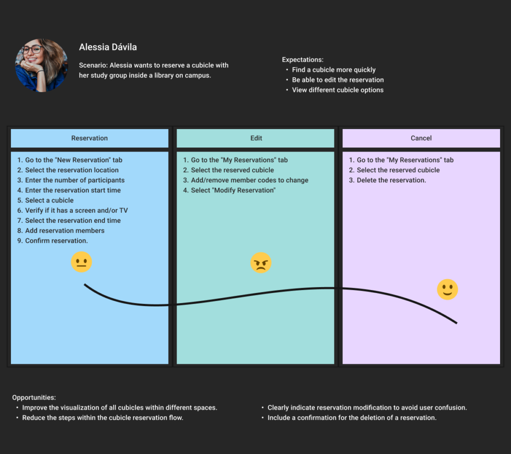
- Cubicle reservation process with too many steps.
- Very outdated interface design.
- Hidden important sections.
- Lack of awareness of some functionalities due to them being hidden.
- Lack of relevant information in each of the courses
- A Dark Mode would be a usefull feature
DEFINE
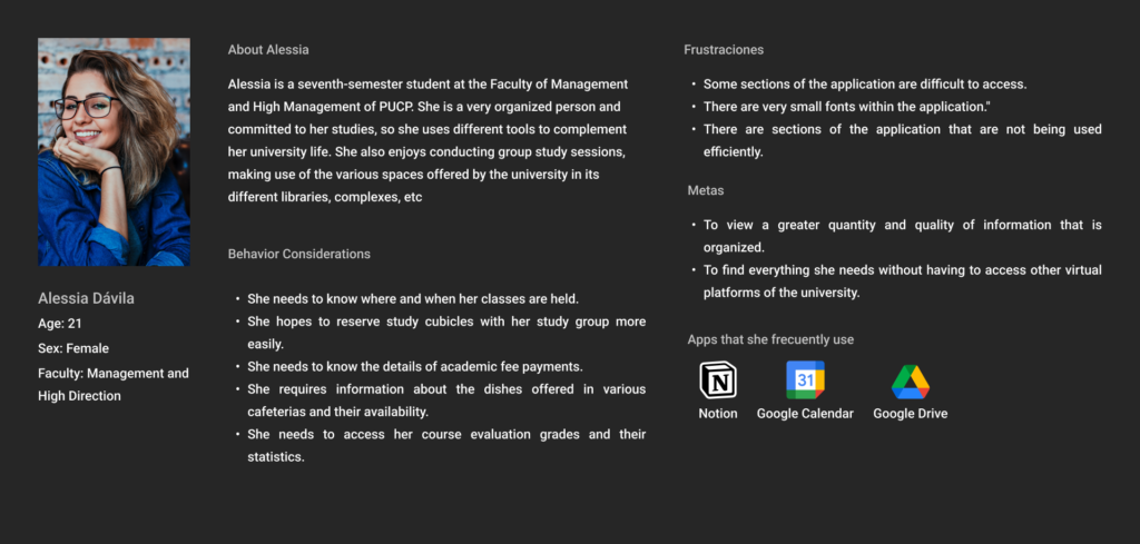
User Persona
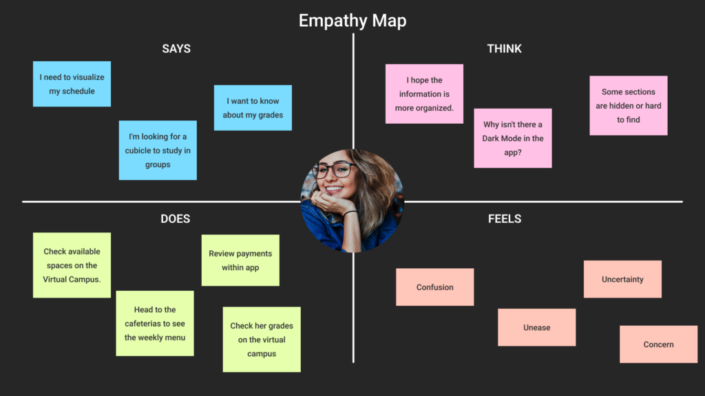
Empathy Map
Jouney Map - Cubicle Reservation
Problem Statement
IDEATE
Proposed Solution
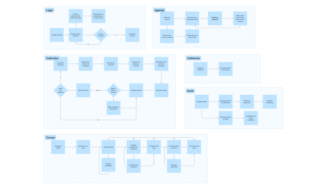
Userflow
Wireframes
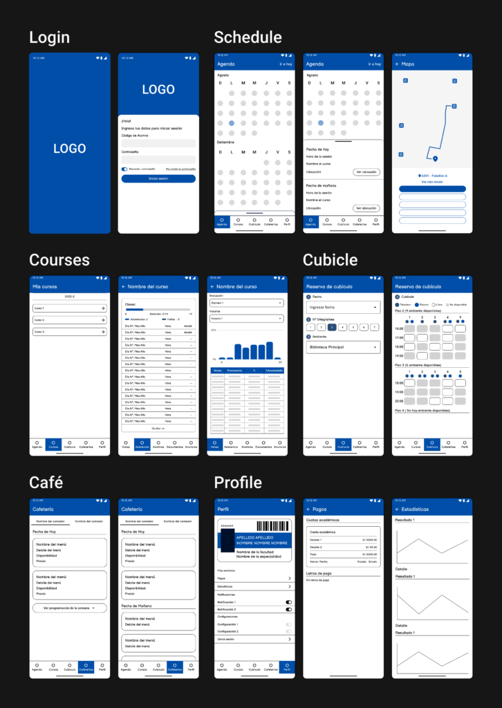
PROTOTYPE
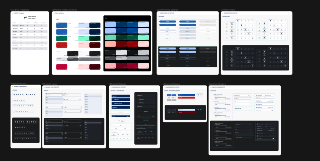
Design System
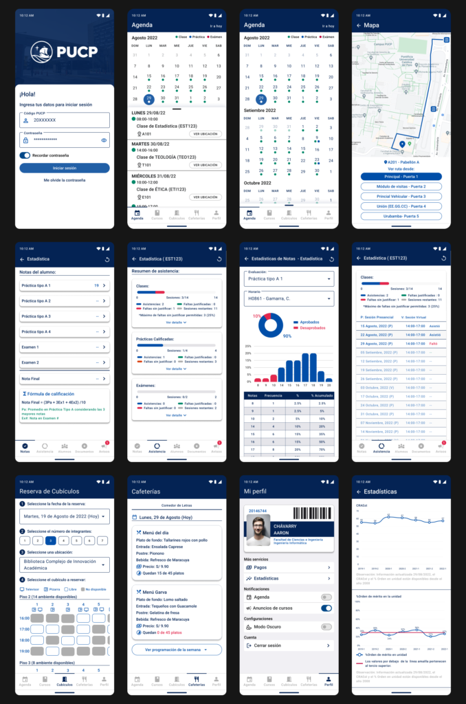
Mockups
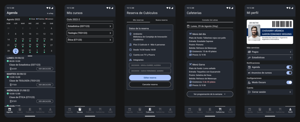
Dark Mode
Functional Prototype
TEST
Usabiliy Testing
For the usability testing of the proposed solution, the number of users was increased to seven. This decision was made to include the Faculty of «Estudios Generales Ciencias» and «Estudios Generales Letras».
The usability testing process was conducted similarly to the first usability test. Each user was assigned specific scenarios corresponding to different sections of the application, such as Agenda, Courses, Cubicles, Cafeterias, and Profile. These scenarios were designed to simulate real-world usage scenarios and evaluate the effectiveness of the proposed interface enhancements in addressing usability issues and improving user experience.
During the testing sessions, users were asked to perform tasks relevant to their assigned scenarios while providing feedback on their experiences, including any difficulties encountered, preferences, and suggestions for improvement
Qualitative Results Summary:
- Improvement in aesthetics and ease of access: Users expressed satisfaction with the aesthetic enhancements and improved accessibility of the interface.
- Positive feedback on cubicle reservation study: Users found the changes made to the cubicle reservation process noticeable and appreciated the improvements.
- Preference for the proposed version: Users indicated a preference for the proposed version over the current one, noting that it is more detailed, precise, complete, organized, and interactive.
- Prioritization of student needs: Users appreciated the organization of information, which prioritizes the needs of students and enhances their overall experience with the application.
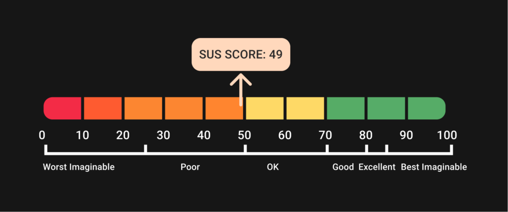
Quantitative Results: A quantitative score of 90 out of 100 points was obtained.

Conclusion:
The case study of the PUCP Móvil application highlights the importance of user-centered design and continuous improvement in digital products. Through an iterative process involving user feedback, usability testing, and interface enhancements, significant strides were made in enhancing the user experience and addressing usability issues identified in the initial assessment.
The redesign of the application’s interface, guided by principles of information organization, aesthetic improvement, and ease of access, resulted in positive feedback from users. The implementation of features such as dark mode, along with the reorganization of sections based on user needs, demonstrated a commitment to meeting the diverse preferences and requirements of the university community.
Usability testing played a crucial role in validating the effectiveness of the proposed changes and identifying areas for further refinement. By increasing the number of users in the testing phase and diversifying the participant pool, a more comprehensive understanding of user perspectives was achieved, leading to more informed design decisions.
References:
- DTI PUCP. (2013). PUCP Móvil (3.5.3) [Aplicación móvil]. Google Play.
- DTI PUCP. (2013). PUCP Móvil (3.8) [Aplicación móvil]. App Store.
- Nielsen, J. (2000, March 18). Why You Only Need to Test with 5 Users. Nielsen Norman Group.
- Budiu, R. (2017, October 1). Quantitative vs. Qualitative Usability Testing. Nielsen Norman Group.
- Nik Ahmad, N. A., & Hussaini, M. (2021). A Usability Testing of a Higher Education Mobile Application Among Postgraduate and Undergraduate Students. International Journal of Interactive Mobile Technologies (iJIM), 15(09), 88.
- Jeff Sauro, PhD (September 19). 5 Ways to Interpret a SUS Score.
- Gibbons. (2018, January 14). Empathy Mapping: The First Step in Design Thinking. Nielsen Norman Group.
- Portal Administrativo PUCP. (2021, July 20). Transformación PUCP: conoce el Manual de identidad.
- Harley. (2016, February 16). Personas Make Users Memorable for Product Team Members. Nielsen Norman Group.
- Usability 101: Introduction to Usability. (2012, January 3). Nielsen Norman Group.
- Canary, A. (2020, February 23). 23 Fantastic Usability Test Questions To Ask (& 11 You Shouldn’t). Rev.
- Laubheimer, P. (2016). Wireflows: A UX Deliverable for Workflows and Apps. Nielsen Norman Group.
- Enriquez, J. G., & Casas, S. I. (2014). Usabilidad en aplicaciones móviles. Informes Científicos – Técnicos UNPA, 5(2), 25–47.
- Mohd Zaki, Z., Ishak, S. F., & Mohamad, K. A. (2021). User Interface Designs of an Educational Mobile Application: A Study of Qiraat Teaching and Learning. Advances in Human-Computer Interaction, 2021, 1–11.
- Relawati, A., Zamroni, G. M., & Primanda, Y. (2022). Unmoderated Remote Usability Testing: An Approach during Covid-19 Pandemic. International Journal of Advanced Computer Science and Applications, 13(1).